
Item added to your basket!
1 October 2026


LIBRA'S CURATED CORNER STYLING SNAPSHOT
• Start with one richer shade and allow it to lead the palette.
• Look beyond traditional orange to merlot, terracotta, brown and amber.
• Balance deeper colours with cream, stone and pale neutrals.
• Create contrast through material and finish as well as colour.
• Repeat similar tones subtly rather than matching every element.
WHAT COLOURS WORK WELL IN AN AUTUMN INTERIOR?
The most interesting autumn colour palettes often move beyond the expected oranges and rusts. Deep red and merlot bring warmth while retaining a grounded quality, while earthy terracotta sits comfortably alongside brown, natural wood and warm metal. Amber and aged bronze can add another layer without making the room feel overtly seasonal.
Artwork can be a useful starting point for a scheme. Rather than matching every accessory directly, draw out one or two shades and repeat them subtly elsewhere. A darker red might appear in artwork, while softer brown or amber tones are introduced through furniture, lighting or decorative details.
The strongest schemes often rely on variation rather than perfect coordination, allowing related colours to appear in slightly different strengths across the room.

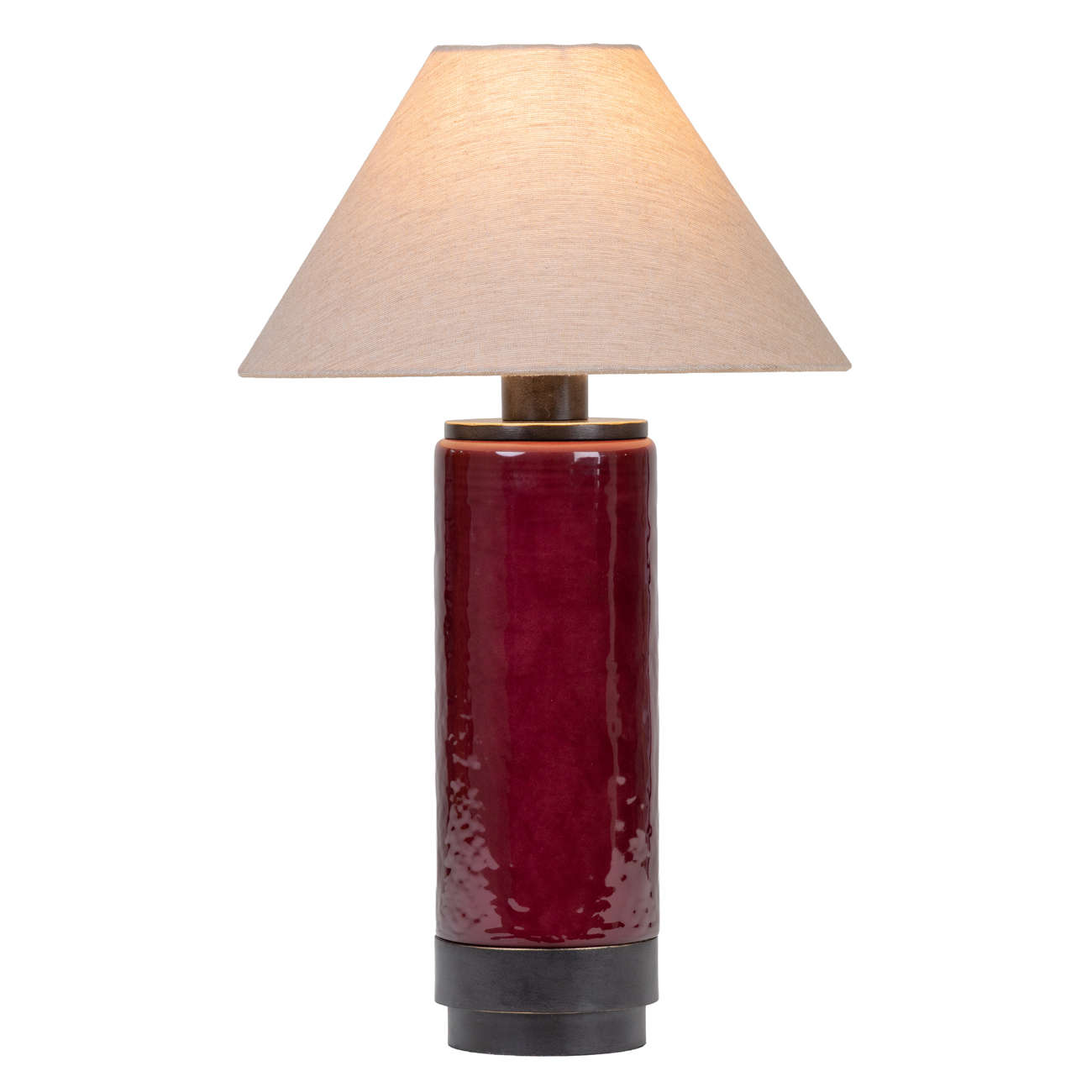
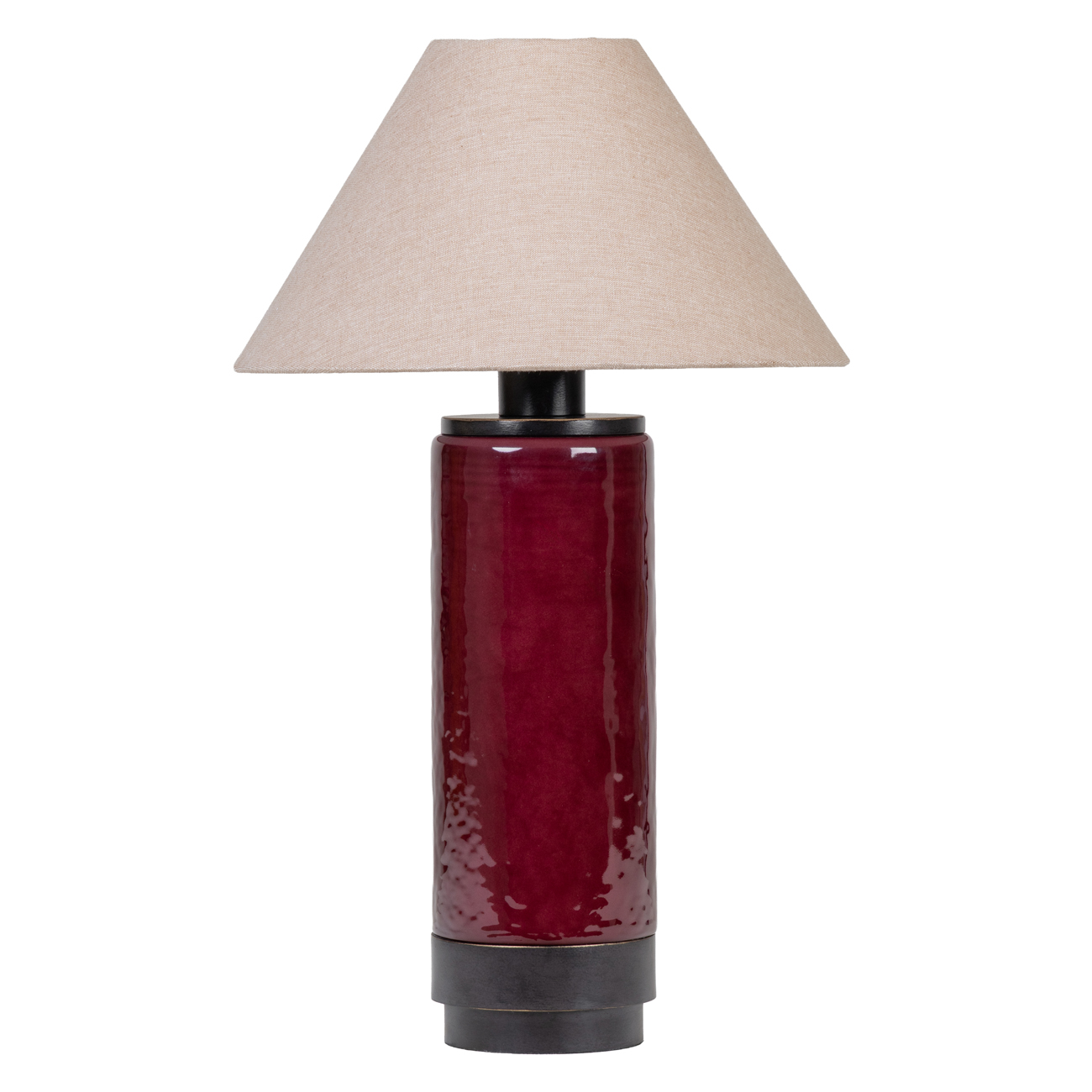
Duthie Table Lamp

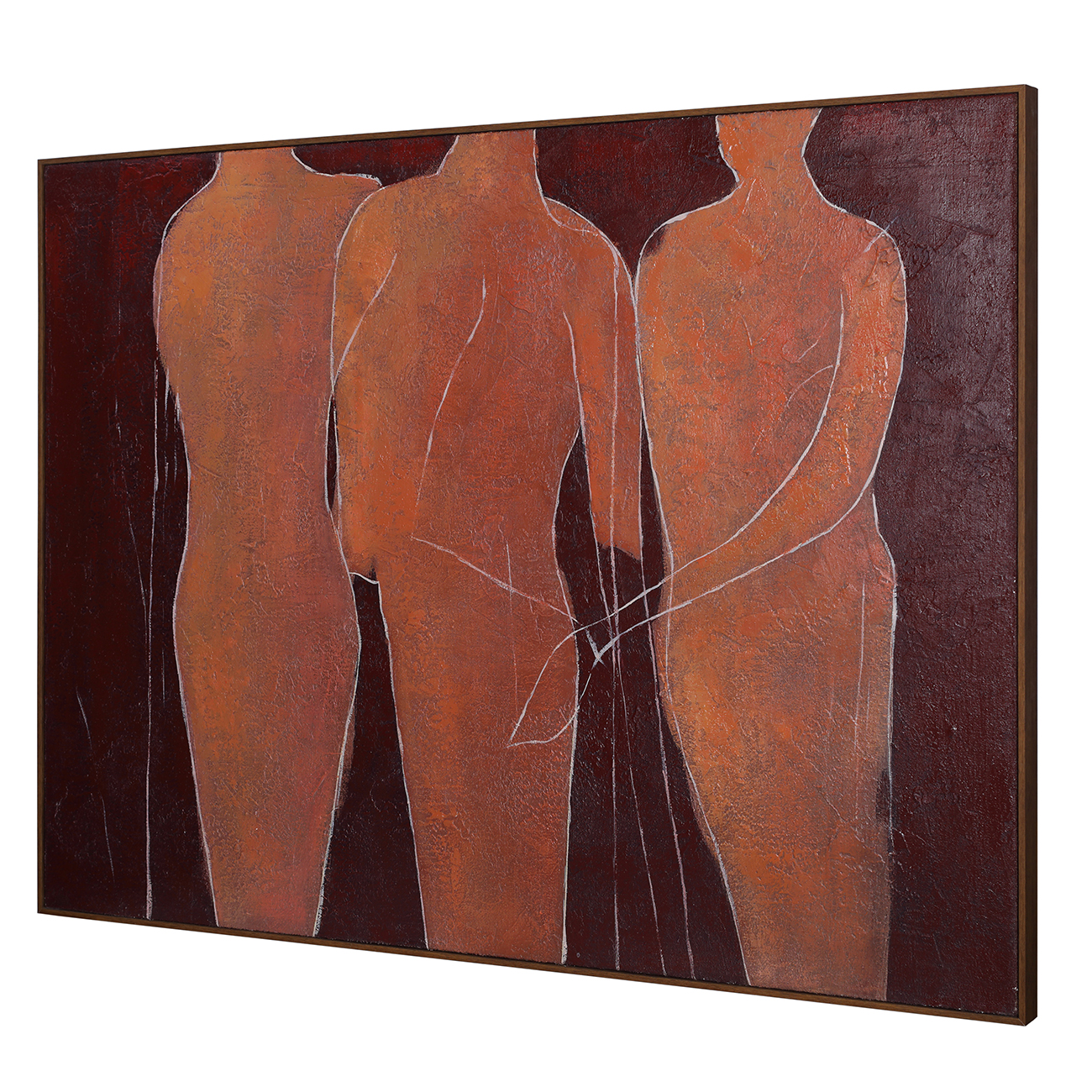
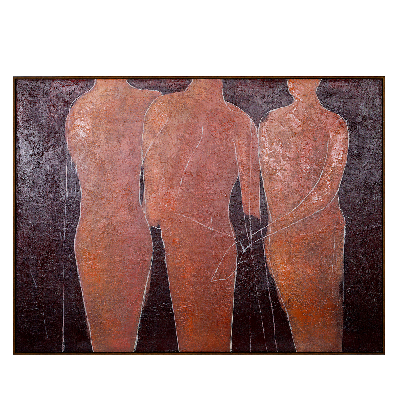
Wall Art: Stone Poise Heavy Textured Hessian
LET ONE COLOUR LEAD
When working with deeper shades, restraint often makes them more effective. Choose one colour to anchor the scheme, then build around it with neighbouring tones and materials. Merlot, for example, can sit comfortably with chocolate brown, antique brass and warm stone without every piece needing to match.
This also makes it easier to work with the room you already have. Cream upholstery, pale walls and natural stone provide a quieter backdrop, while one or two richer elements introduce contrast. If your room already includes warm timber or brown upholstery, amber and bronze can add depth without taking the palette in a completely different direction.

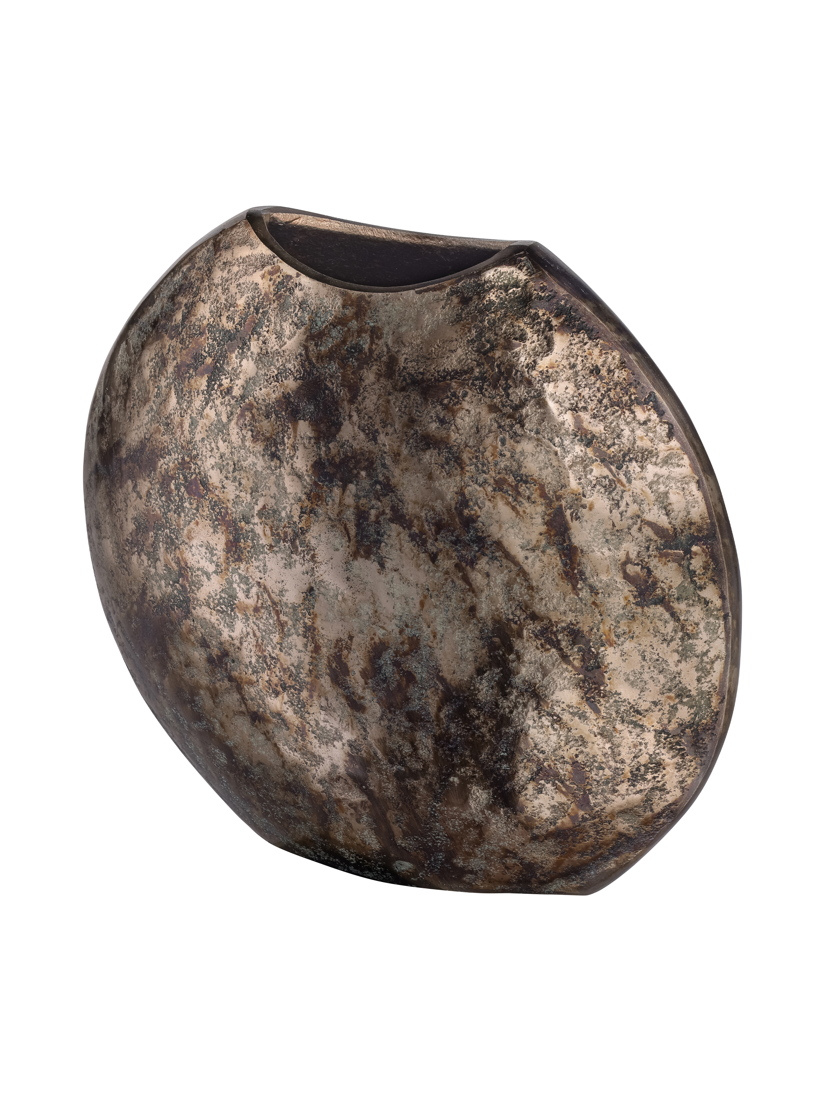
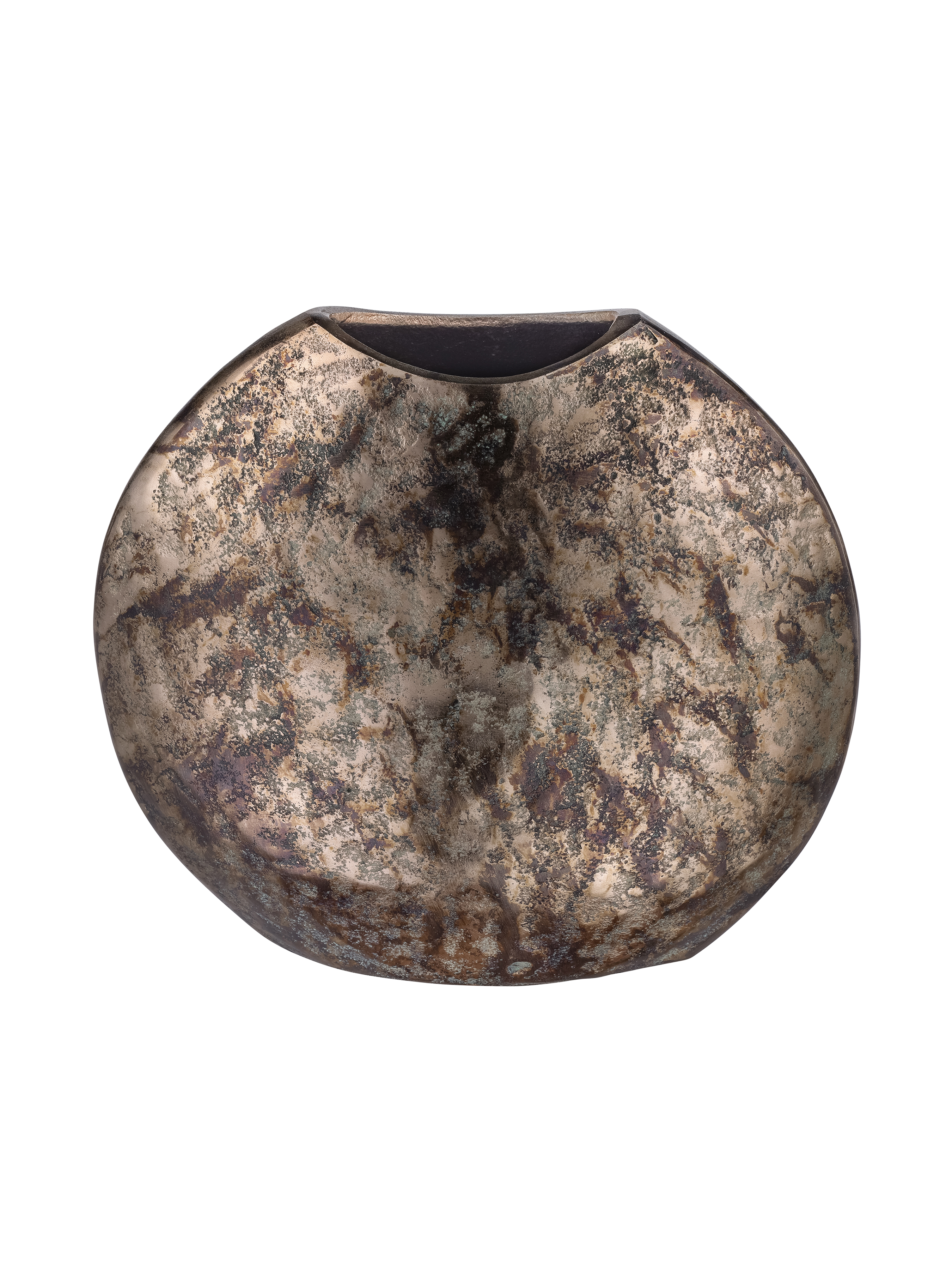
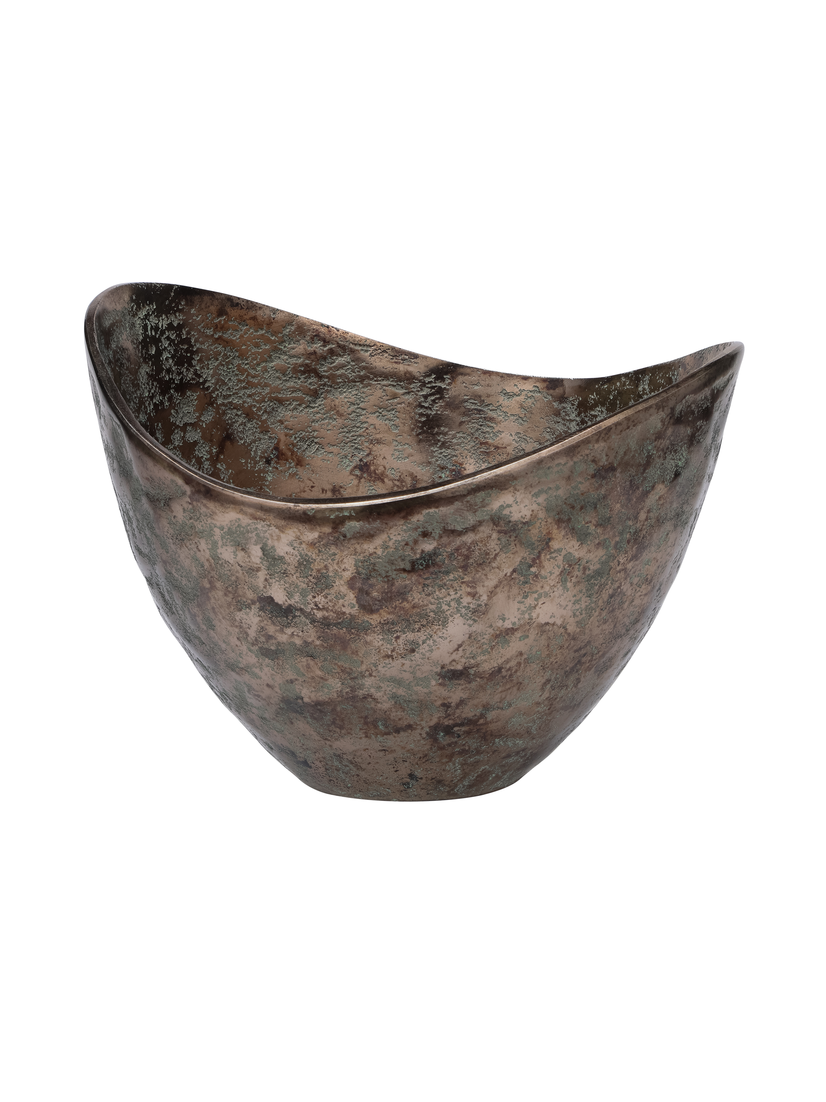
Velmora vase
HOW CAN TEXTURE MAKE AUTUMN COLOURS FEEL RICHER?
Colour is only part of what gives an interior depth. Texture changes the way a shade is experienced, with matte ceramic absorbing light differently from glossy glass, while aged metal develops highlights and shadows across its surface.
Combining finishes can therefore make a relatively simple palette feel much more layered. Glass, ceramic, metal and stone each respond differently to light, creating variation even when the colours themselves remain closely related. Rather than continually introducing new shades, contrast a smooth finish with something textured or heavily worked.

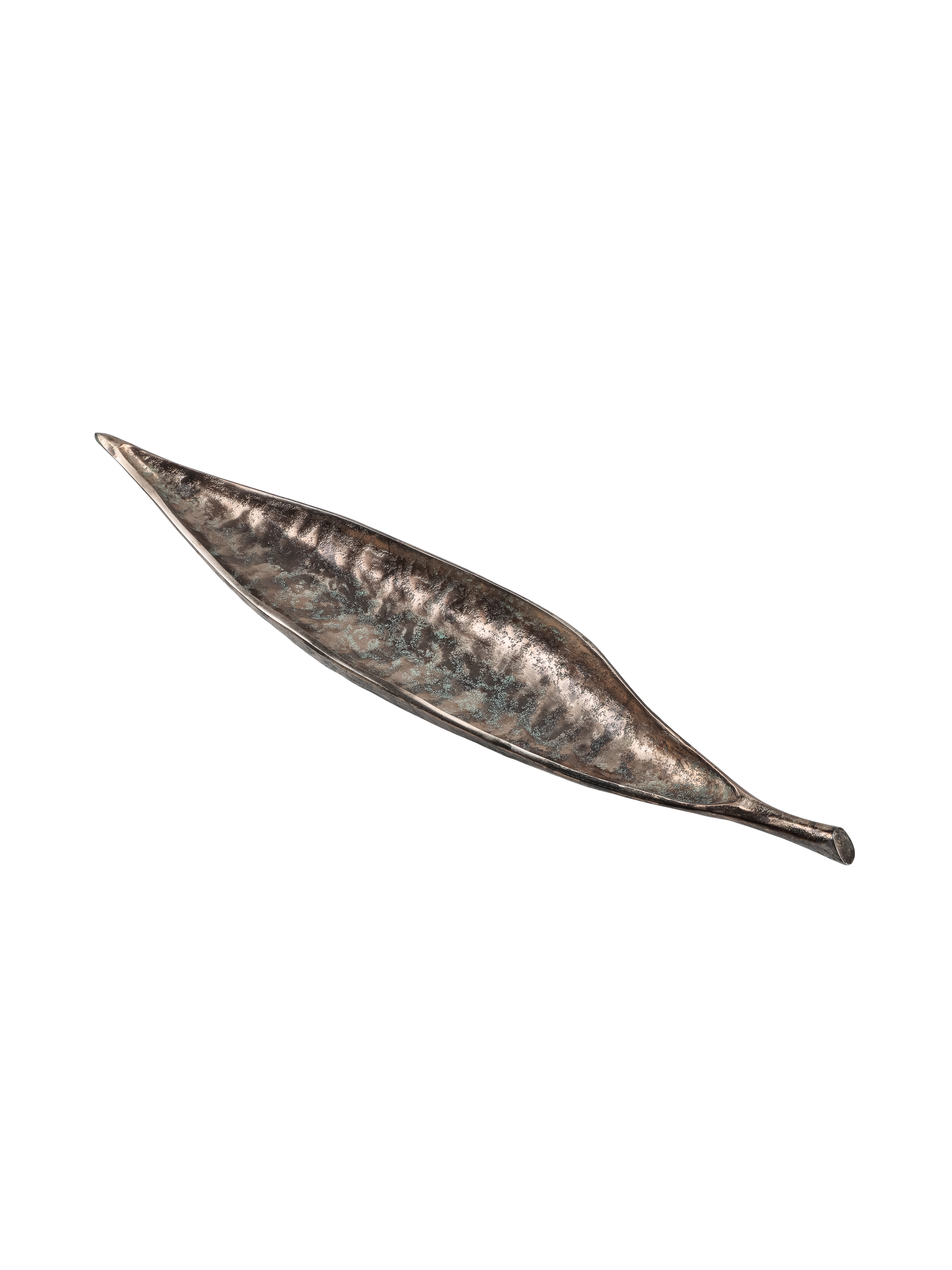
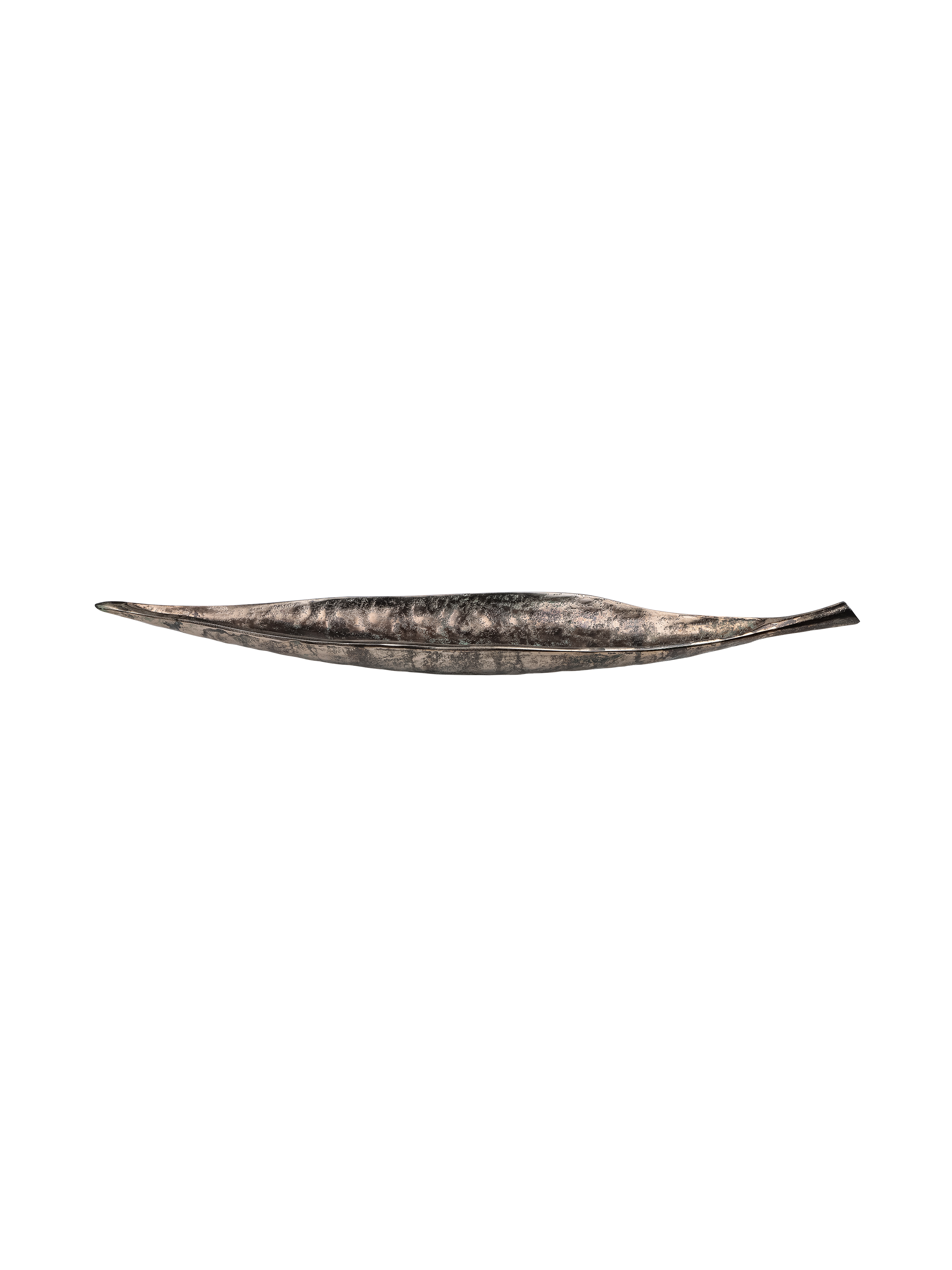
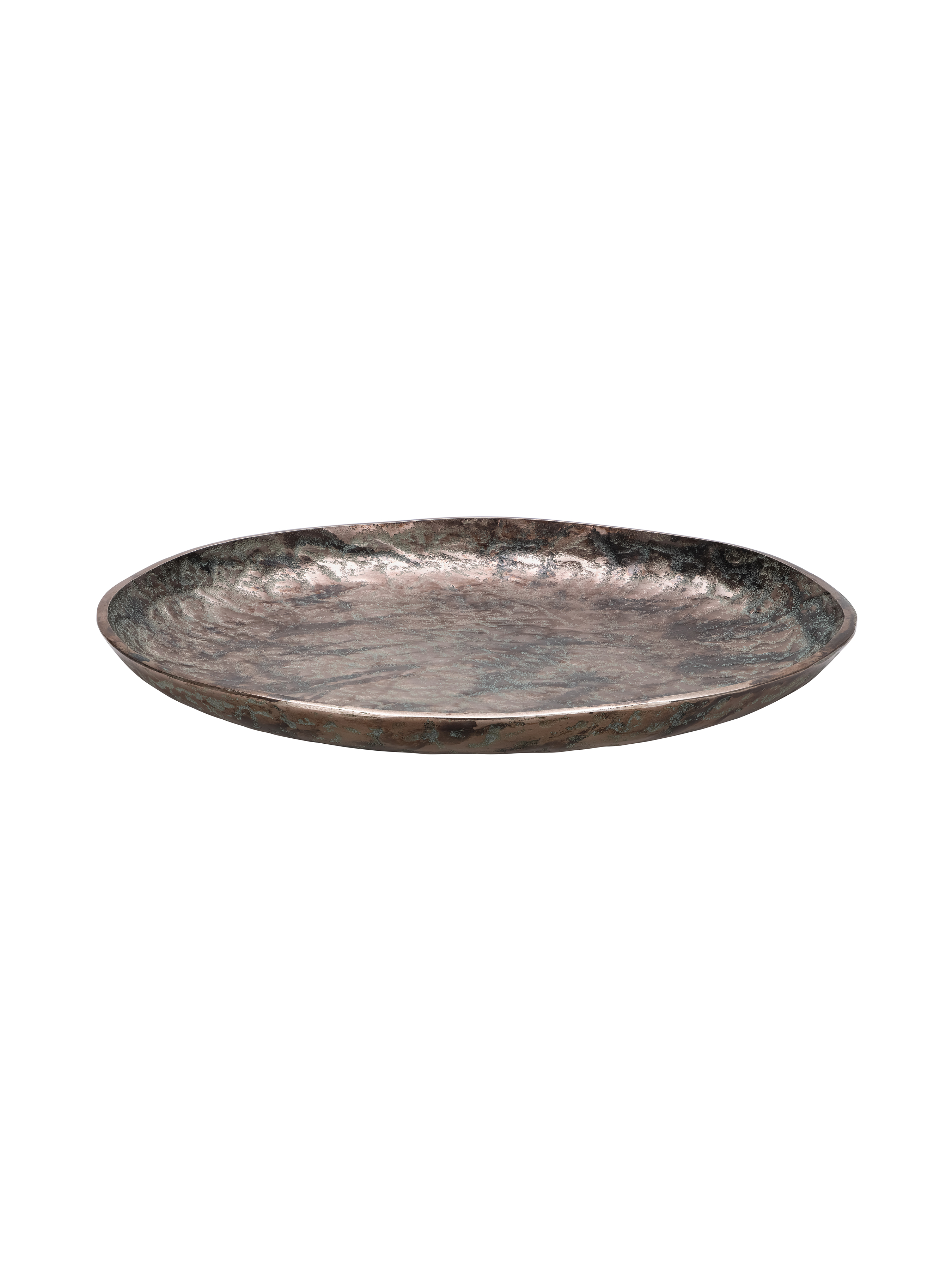
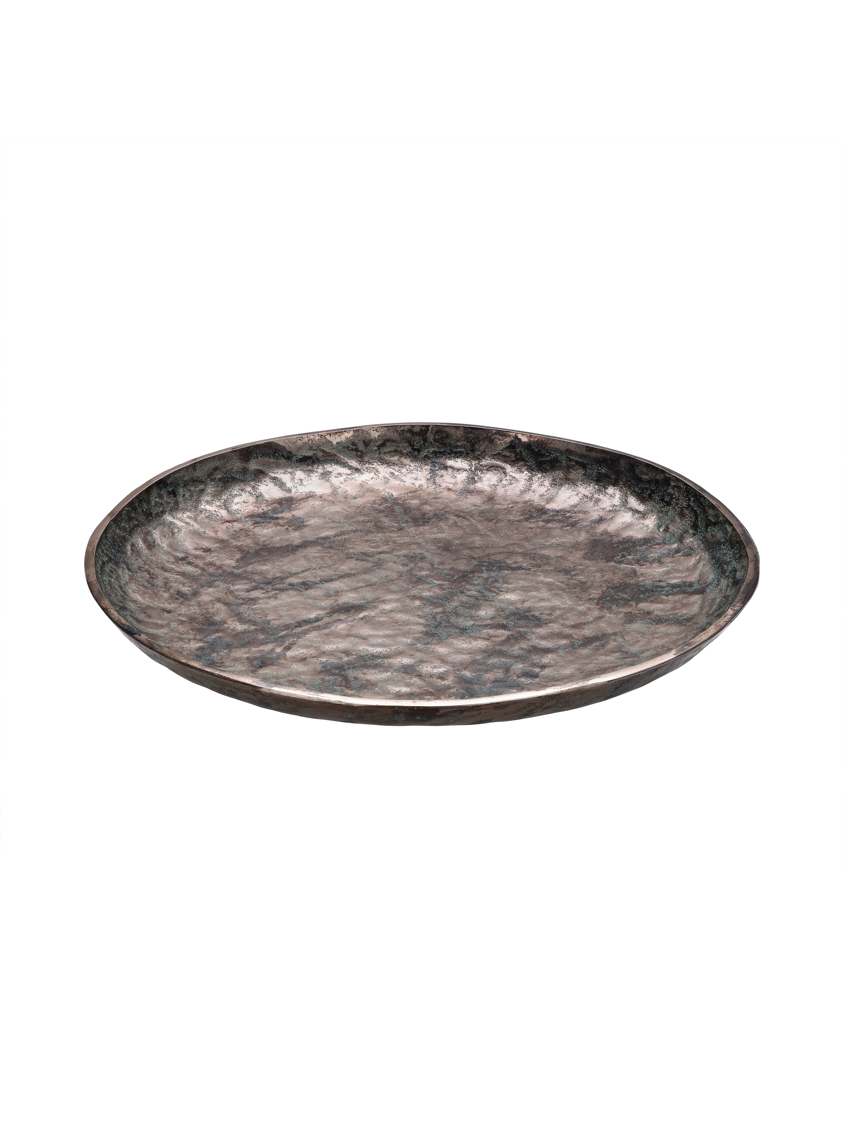
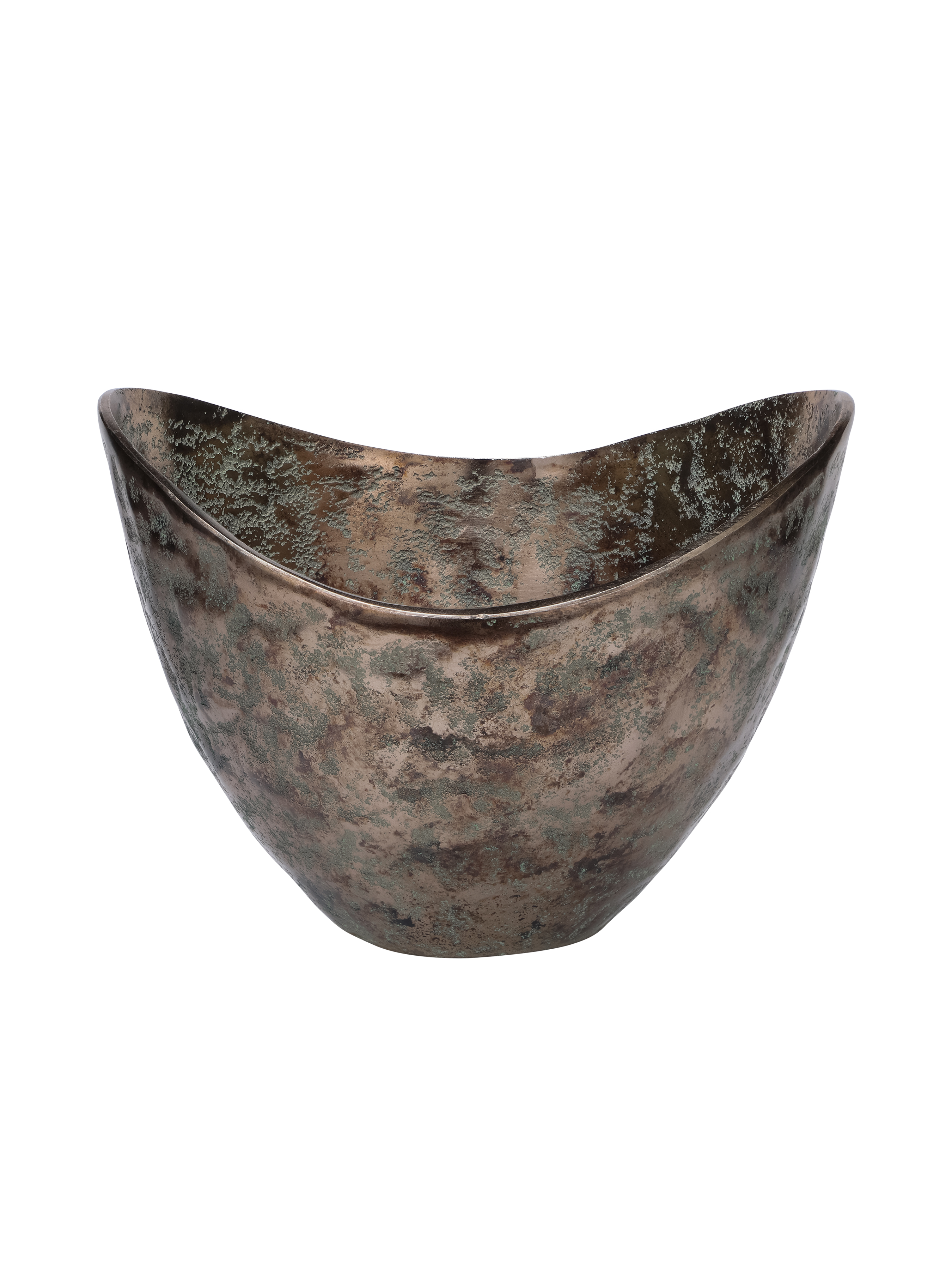
Velmora platter
HOW DO YOU BALANCE DARK AUTUMN COLOURS?
Rich colour becomes more effective when there is contrast. If every surface is dark, deeper shades can lose their impact, whereas pale stone, cream upholstery, and neutral walls give stronger colours room to stand out.
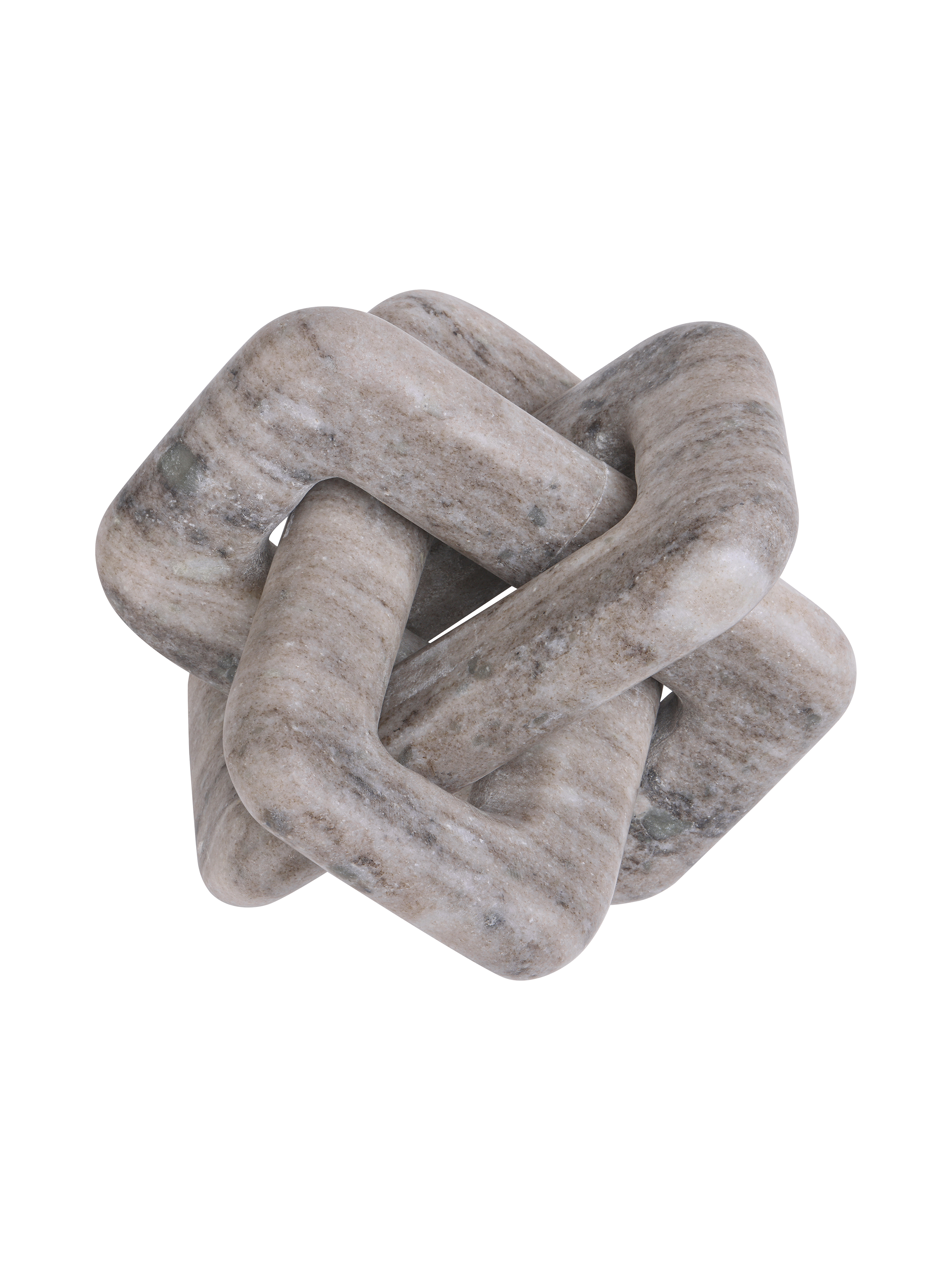
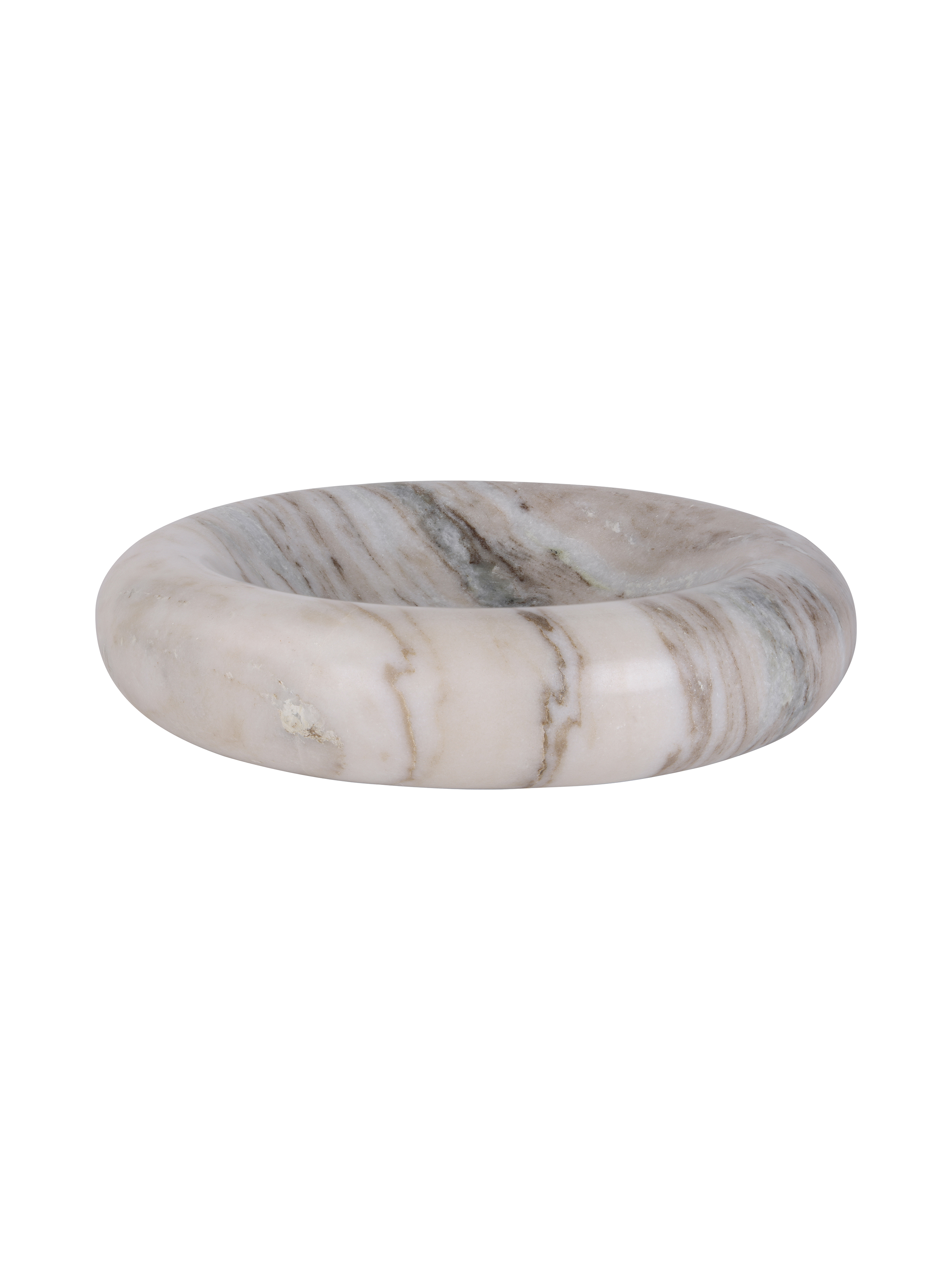
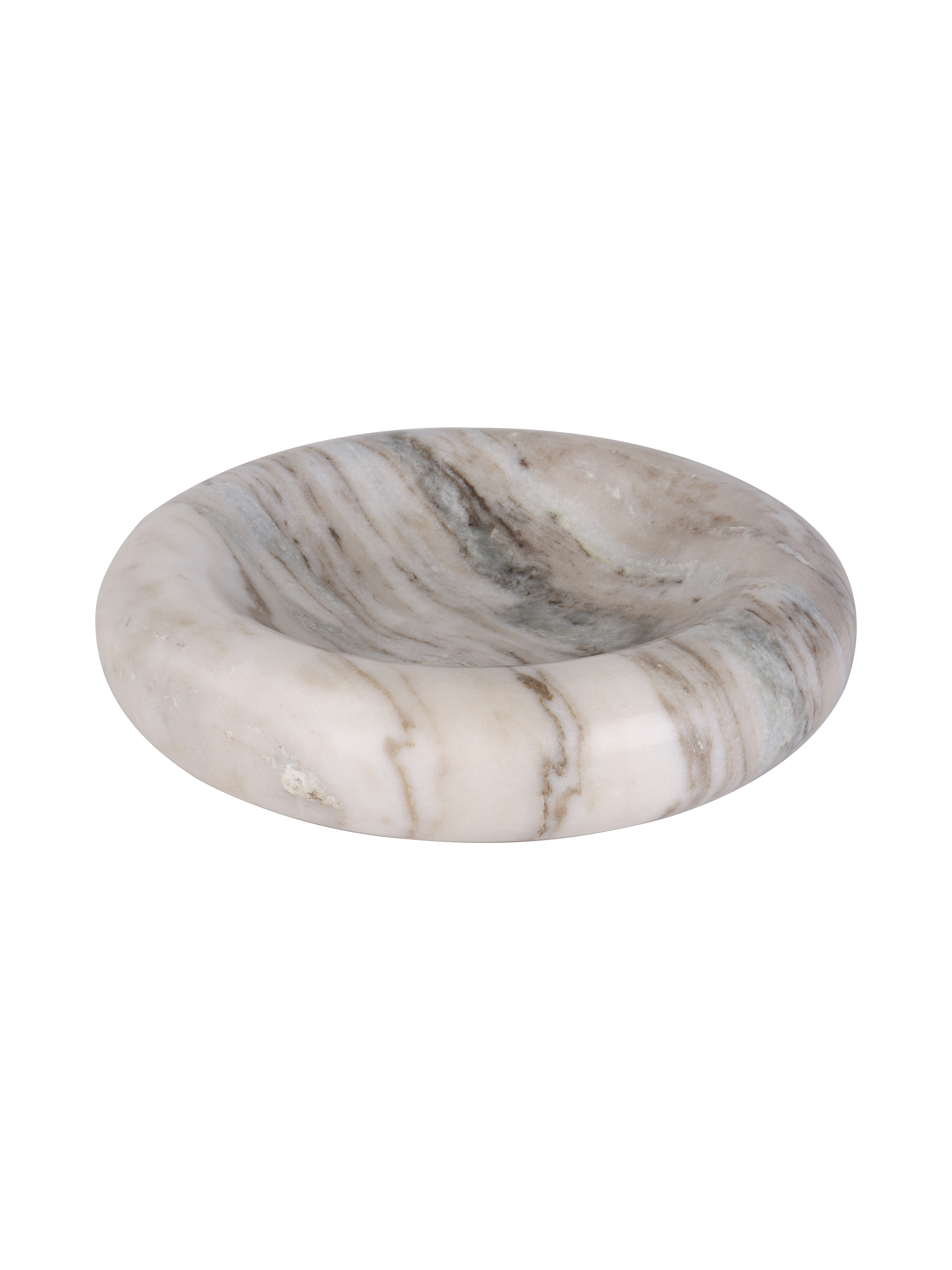
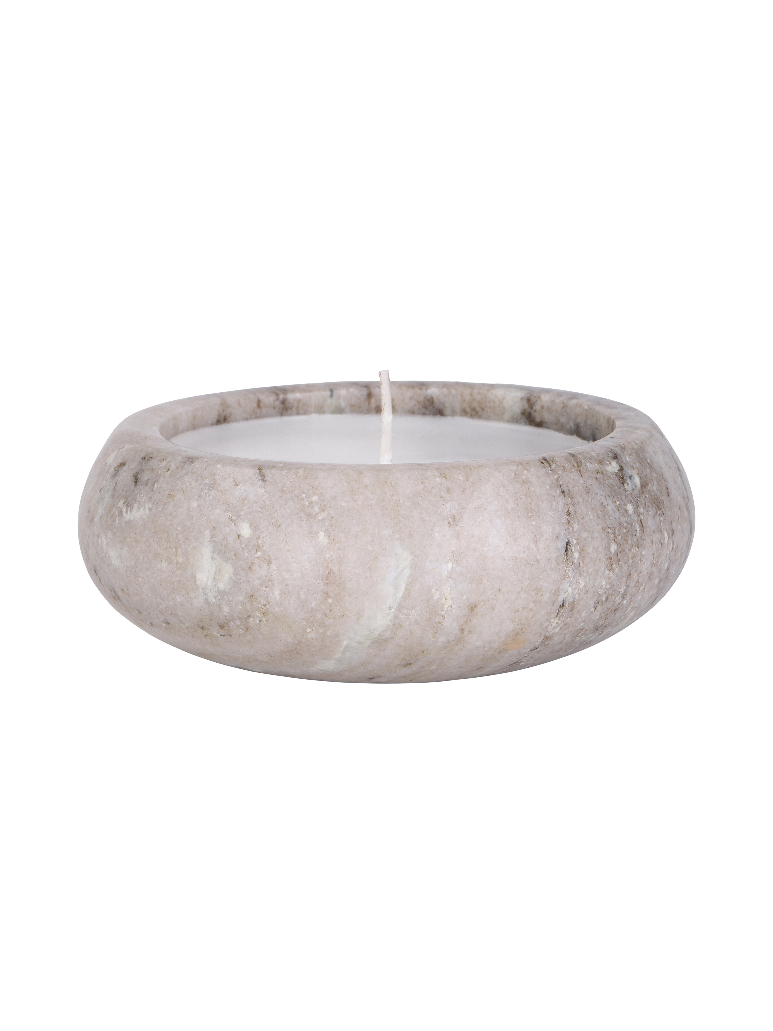
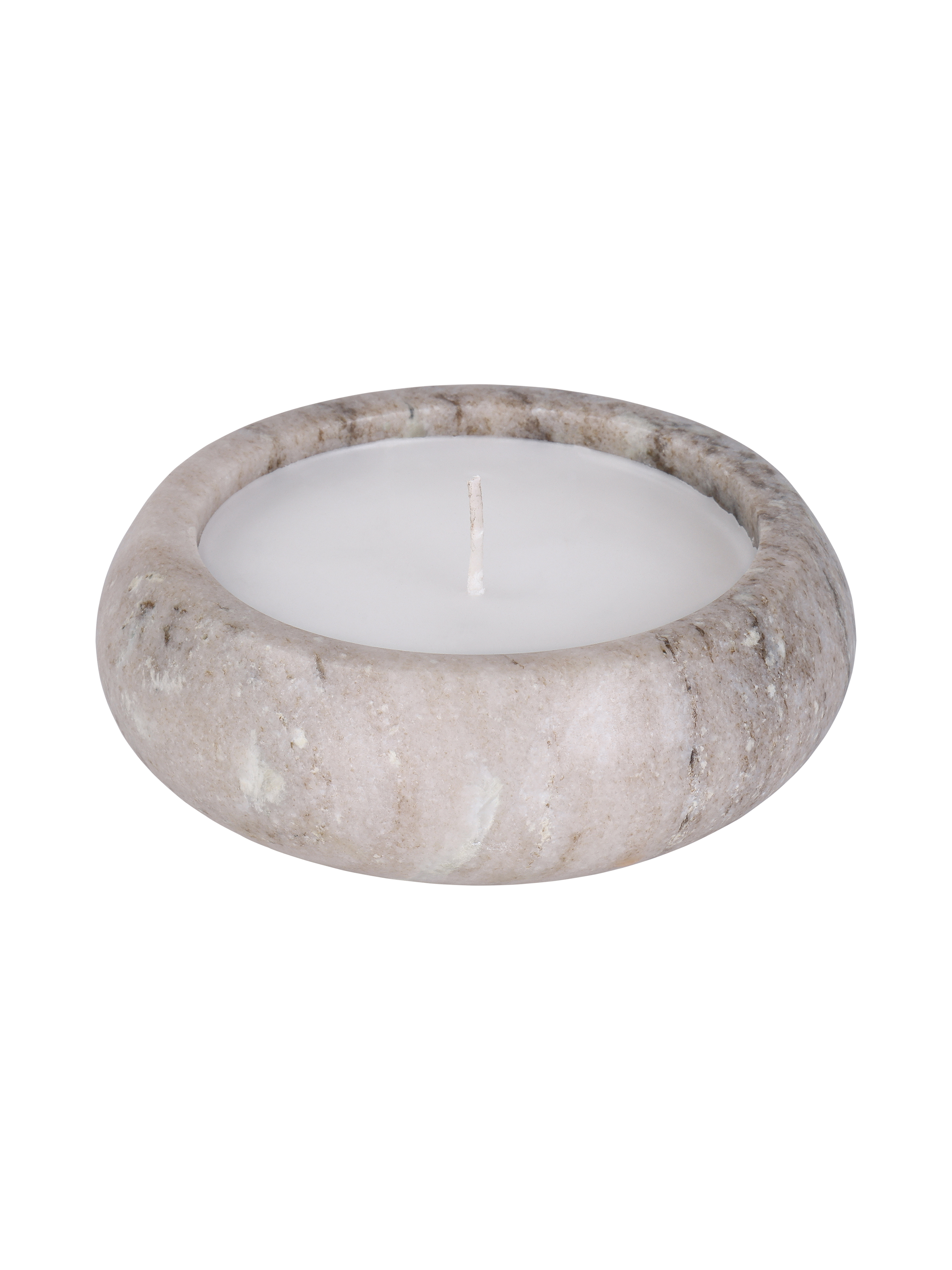
Natural materials work particularly well here. Beige marble, pale wood and softly textured fabrics can sit comfortably alongside deep red, brown or bronze while providing a quieter tonal break. The same principle applies when styling a surface: leaving space around a vase, lamp or decorative object can give it more presence than filling every available gap.
HOW TO INTRODUCE AUTUMN COLOUR WITHOUT MAKING IT FEEL SEASONAL
The most successful autumn palettes are not limited to a few months of the year.
Rather than adding accessories that only feel relevant for the season, focus on colours that can remain part of the room long afterwards. Deep brown, merlot, warm brass and natural stone work just as comfortably in winter and beyond.
A seasonal update might simply involve introducing a darker piece of artwork, changing one lighter accessory for something richer in tone or repeating a colour already present elsewhere in the room. The change can be subtle while still giving a familiar space a different character.

BRING THE LOOK HOME
For a neutral room, begin with one stronger element and work outwards. The Stone Poise Heavy Textured Hessian Wall Art introduces rich terracotta and deep oxblood tones across a heavily textured surface, making it a natural starting point for a deeper palette.
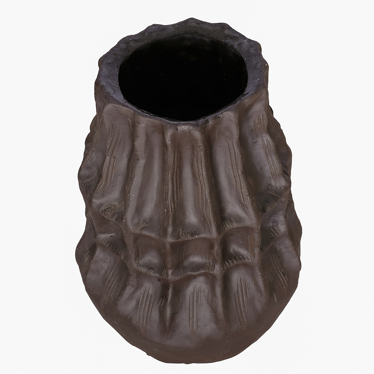
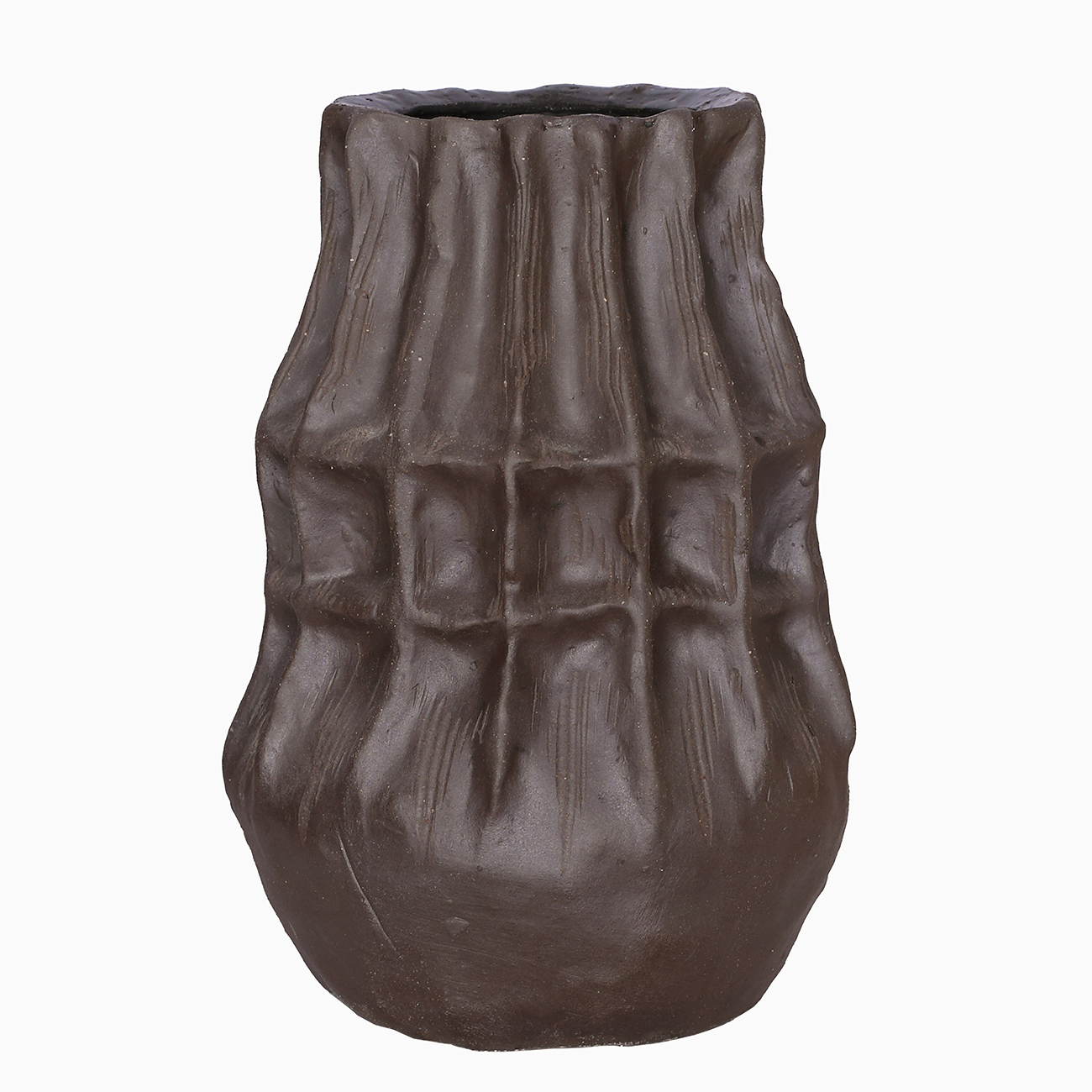
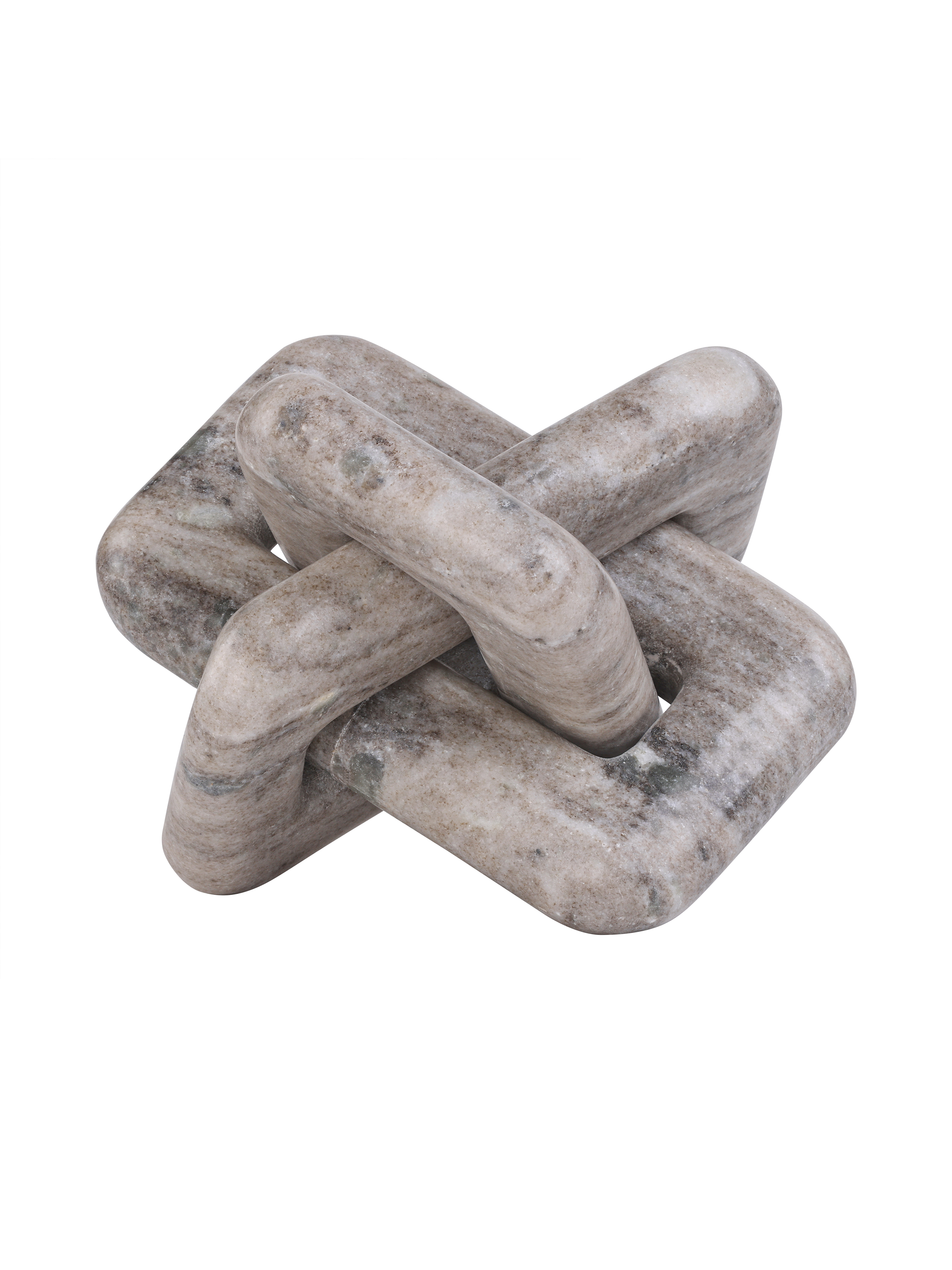
The Duthie Table Lamp in Merlot Red can echo those warmer red tones through its glossy glass body, while the Kova Brown Textured Ceramic Tall Vase adds an earthier shade and contrasting matt surface. Selected pieces from the Velmora Collection bring in warm bronze tones, dark mottling and subtle verdigris detailing, while the natural beige marble of the Orla Collection provides a softer counterpoint.
The aim is not to match every finish. Allow the relationship between colour, texture and material to connect the arrangement naturally.

Kova tall vase

Orla bowl
A SEASONAL SHIFT THAT LASTS
Autumn is a natural moment to explore a richer side of colour in the home. By starting with one deeper shade and balancing it with quieter tones and varied materials, familiar spaces can take on greater depth without requiring a complete redesign.
The result should feel considered rather than seasonal, allowing the palette to remain part of the interior long after autumn has passed.